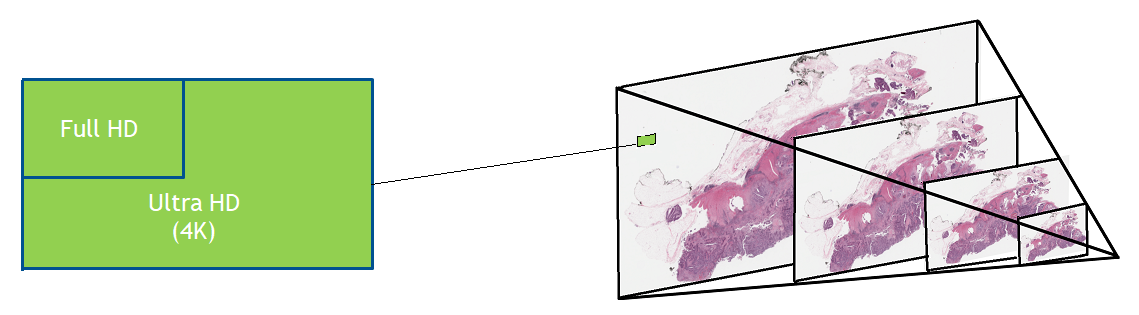
Digital pathology slide scanners generate massive images. Glass slides are routinely scanned at 40x magnification, resulting in gigapixel images. Compression…
Digital pathology slide scanners generate massive images. Glass slides are routinely scanned at 40x magnification, resulting in gigapixel images. Compression can reduce the file size to 1 or 2 GB per slide, but this volume of data is still challenging to move around, save, load, and view. To view a typical whole slide image at full resolution would require a monitor about the size of a tennis court.
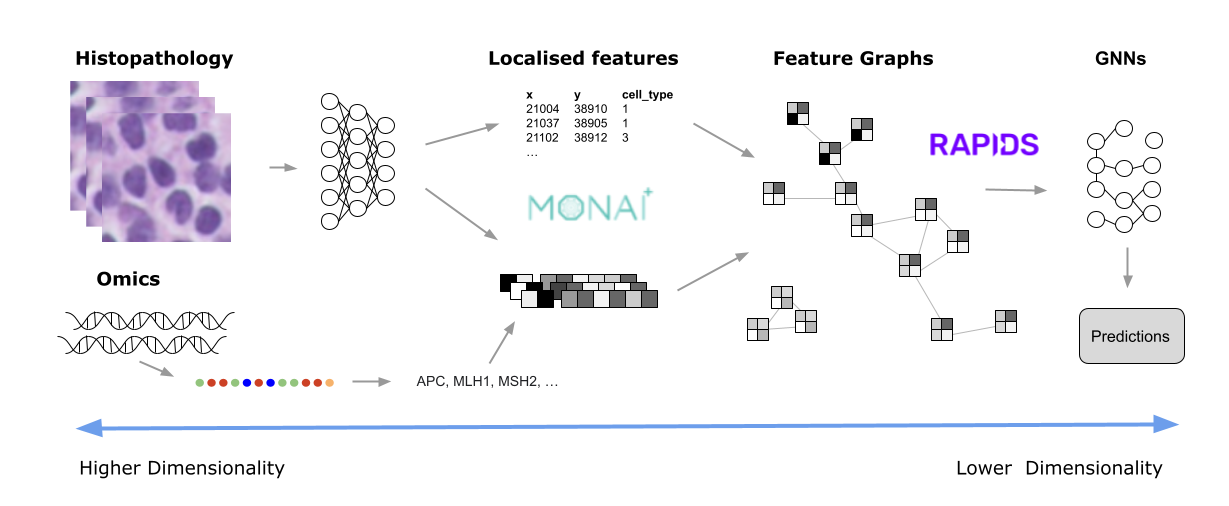
Like histopathology, both genomics and microscopy can easily generate terabytes of data. Some use cases involve multiple modalities. Getting this data into a more manageable size usually involves progressive transformations, until only the most salient features remain. This post explores some ways this data refinement might be accomplished, the type of analytics used, and how tools such as MONAI and RAPIDS can unlock meaningful insights. It features a typical digital histopathology image as an example, as these are now used in routine clinical settings across the globe.
MONAI is a set of open-source, freely available collaborative frameworks optimized for accelerating research and clinical collaboration in medical imaging. RAPIDS is a suite of open-source software libraries for building end-to-end data science and analytics pipelines on GPUs. RAPIDS cuCIM, a computer vision processing software library for multidimensional images, accelerates imaging for MONAI, and the cuDF library helps with the data transformation required for the workflow.
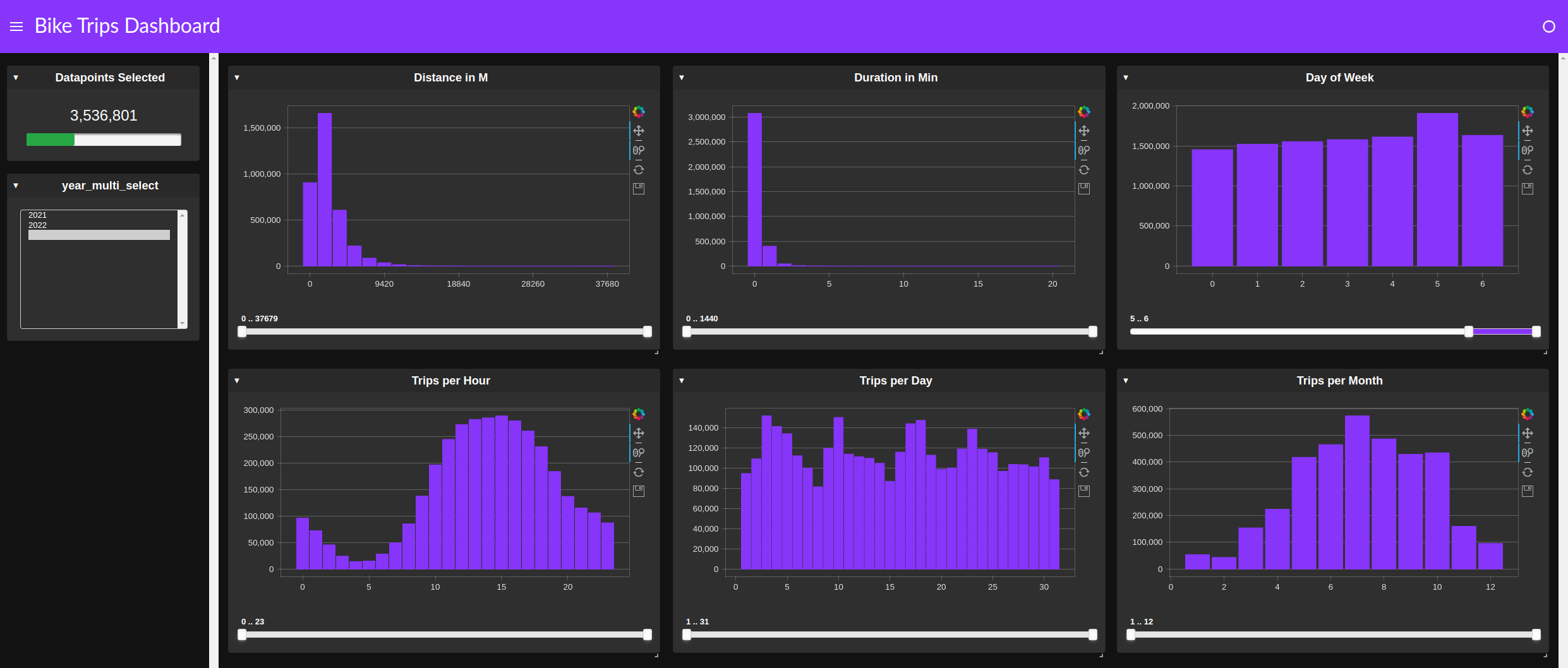
Managing whole slide image data
Previous work has shown how cuCIM can speed up the loading of whole slide images. See, for example, Accelerating Scikit-Image API with cuCIM: n-Dimensional Image Processing and I/O on GPUs.
But what about the rest of the pipeline, which may include image preprocessing, inference, postprocessing, visualization, and analytics? A growing number of instruments capture a variety of data, including multi-spectral images, and genetic and proteomic data, all of which present similar challenges.
Diseases such as cancer emanate from cell nuclei, which are only ~5-20 microns in size. To discern the various cell subtypes, the shape, color, internal textures, and patterns need to be visible to the pathologist. This requires very large images.
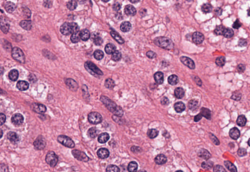
Given that a common input size for a 2D deep learning algorithm (such as DenseNet) is usually around 200 x 200 pixels, high-resolution images need to be split into patches–potentially 100,000–just for one slide.
The slide preparation and tissue staining process can take hours. While the value of low-latency inference results is minimal, the analysis must still keep up with the digital scanner acquisition rate to prevent a backlog. Throughput is therefore critical. The way to improve throughput is to process the images faster or compute many images simultaneously.
Potential solutions
Data scientists and developers have considered many approaches to make the problem more tractable. Given the size of the images and the limited time pathologists have to make diagnoses, there is no practical way to view every single pixel at full resolution.
Instead, they review images at lower resolution and then zoom into the regions they identify as likely to contain features of interest. They can usually make a diagnosis having viewed 1-2% of the full resolution image. In some respects, this is like a detective at a crime scene: most of the scene is irrelevant, and conclusions usually hinge on one or two fibers or fingerprints that provide key information.
Unlike their human counterparts, AI and machine learning (ML) are not able to discard 98-99% of the pixels of an image, because of concerns that they might miss some critical detail. This may be possible in the future, but would require considerable trust and evidence to show that it is safe.
In this respect, current algorithms treat all input pixels equally. Various algorithmic mechanisms may subsequently assign more or less weight to them (Attention, Max-Pooling, Bias and Weights), but initially they all have the same potential to influence the prediction.
This not only puts a large computational burden on histopathology processing pipelines, but also requires moving a substantial amount of data between disk, CPU, and GPU. Most histopathology slides contain empty space, redundant information, and noise. These properties can be exploited to reduce the actual computation needed to extract the important information.
For example, it may be sufficient for a pathologist to count certain cell types within a pertinent region to classify a disease. To do this, the algorithm must turn pixel-intensity values into an array of nucleus centroids with an associated cell-type label. It is then very simple to compute the cell counts within a region. There are many ways in which whole slide images are filtered down to the essential elements for the specific task. Some examples might include:
- Learning a set of image features using unsupervised methods, such as training a variational autoencoder, to encode image tiles into a small embedding.
- Localizing all the features of interest (nuclei, for example) and only using this information to derive metrics using a specialized model such as HoVerNet.
MONAI and RAPIDS
For either of these approaches, MONAI provides many models and training pipelines that you can customize for your own needs. Most are generic enough to be adapted to the specific requirements of your data (the number of channels and dimensions, for example), but several are specific to, say, digital pathology.
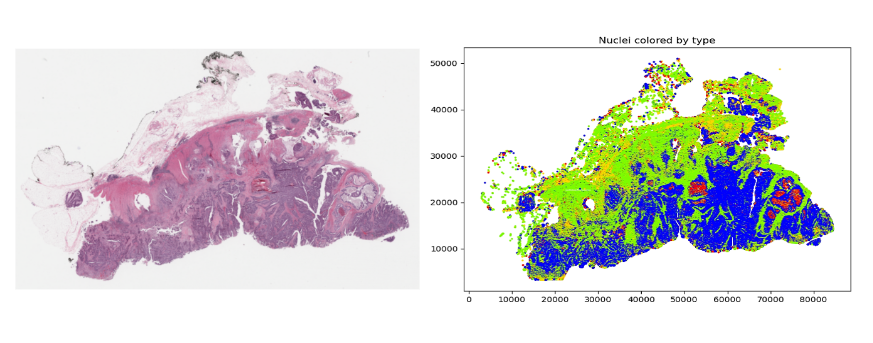
Once these features have been derived, they can be used for analysis. However, even after this type of dimensionality reduction, there may still be many features to analyze. For example, Figure 3 shows an image (originally 100K x 60K RGB pixels) with hundreds of thousands of nuclei. Even generating an embedding for each 64 x 64 tile could still result in millions of data points for one slide.
This is where RAPIDS can help. The open-source suite of libraries for GPU-accelerated data science with Python includes tools that cover a range of common activities, such as ML, graph analytics, ETL, and visualization. There are a few underlying technologies, such as CuPy that enable different operations to access the same data in GPU memory without having to copy or restructure the underlying data. This is one of the primary reasons that RAPIDS is so, well, rapid.
One of the main interaction tools for developers is the CUDA accelerated DataFrame (cuDF). Data is presented in a tabular format and can be filtered and manipulated using the cuDF API with pandas-like commands, making it easy to adopt. These dataframes are then used as the input to many of the other RAPIDS tools.
For example, suppose you want to create a graph from all of the nuclei, linking each nucleus to its nearest neighbors within a certain radius. To do this, you need to present a dataframe to the cuGraph API that has columns representing the source and destination nodes of each graph edge (with an optional weight). To generate this list, you can use the cuML Nearest Neighbor search capability. Again, simply provide a dataframe listing all of the nuclei coordinates and cuML will do all the heavy lifting.
from cuml.neighbors import NearestNeighbors

knn = NearestNeighbors()
knn.fit(cdf)
distances, indices = knn.kneighbors(cdf, 5)
Note that the distances calculated are, by default, Euclidean distances and, to save unnecessary computation, they are squared values. Secondly, the algorithm may use heuristics by default. If you want actual values, you can specify the optional algorithm=‘brute’ parameter. Either way, the computation is extremely fast on a GPU.
Next, merge the distance and indices dataframes into one single dataframe. To do this, you need to assign unique names to the distance columns first:
distances.columns=['ix2','d1','d2','d3','d4']
all_cols = cudf.concat(
[indices[[1,2,3,4]], distances[['d1','d2','d3','d4']]],
axis=1)
Each row must correspond to an edge in the graph, so the dataframe needs to be split into a row for each nearest neighbor. Then the columns can be renamed as ‘source’, ‘target,’ and ‘distance.’
all_cols['index1'] = all_cols.index
c1 = all_cols[['index1',1,'d1']]
c1.columns=['source','target','distance']
c2 = all_cols[['index1',2,'d2']]
c2.columns=['source','target','distance']
c3 = all_cols[['index1',3,'d3']]
c3.columns=['source','target','distance']
c4 = all_cols[['index1',4,'d4']]
c4.columns=['source','target','distance']


edges = cudf.concat([c1,c2,c3,c4])
edges = edges.reset_index()
edges = edges[['source','target','distance']]
To eliminate all neighbors beyond a certain distance, use the following filter:
distance_threshold = 15
edges = edges.loc[edges["distance"]
At this point, you could dispense with the ‘distance’ column unless the edges within the graph need to be weighted. Then create the graph itself:
cell_graph = cugraph.Graph()
cell_graph.from_cudf_edgelist(edges,source='source', destination='target', edge_attr='distance', renumber=True)
After you have the graph, you can do standard graph analysis operations. Triangle count is the number of cycles of length three. A k-core of a graph is a maximal subgraph that contains nodes of degree k or more:
count = cugraph.triangle_count(cell_graph)
coreno = cugraph.core_number(cell_graph)
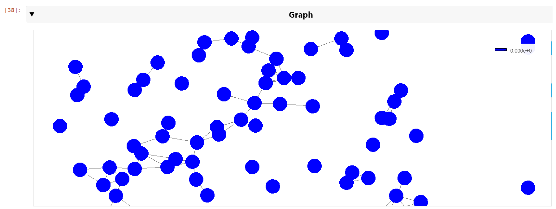
It is also possible to visualize the graph, even though it may contain hundreds of thousands of edges. With a modern GPU, the graph can be viewed and navigated in real time. To generate visualizations such as this, use cuXFilter:
nodes = tiles_xy_cdf
nodes['vertex']=nodes.index
nodes.columns=['x','y','vertex']
cux_df = fdf.load_graph((nodes, edge_df))


chart0 = cfc.graph(
edge_color_palette=['gray', 'black'],
timeout=200,
node_aggregate_fn='mean',
node_pixel_shade_type='linear',
edge_render_type='direct',#other option available -> 'curved', 	edge_transparency=0.5)
d = cux_df.dashboard([chart0], layout=clo.double_feature)
chart0.view()
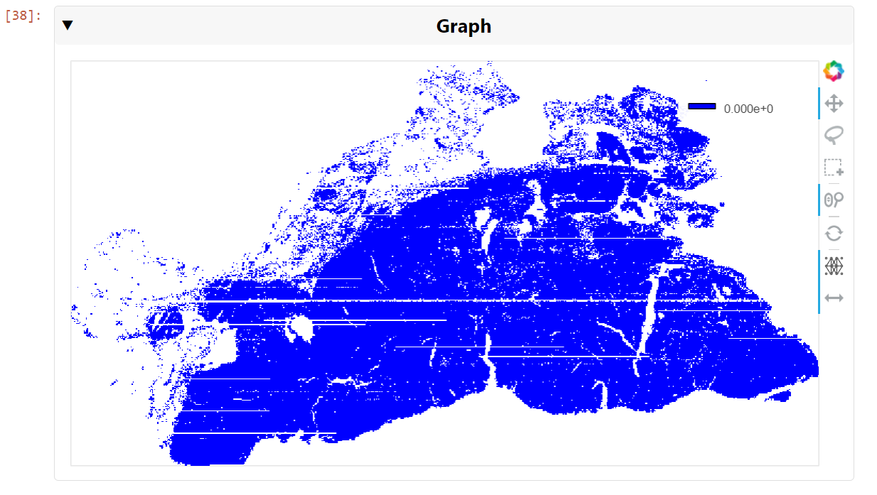
You can then pan and zoom down to the cell nuclei level to see the clusters of nearest neighbors (Figure 6).
Conclusion
Drawing insights from raw pixels can be difficult and time consuming. Several powerful tools and techniques can be applied to large-image problems to provide near-real-time analysis of even the most challenging data. Apart from ML capabilities, GPU-accelerated tools such as RAPIDS also provide powerful visualization capabilities that help to decipher the computational features that DL-based methods produce. This post has described an end-to-end set of tools that can ingest, preprocess, infer, postprocess, plot using DL, ML Graph, and GNN methods.
Get started with RAPIDS and MONAI and unleash the power of GPUs on your data. And join the MONAI Community in the NVIDIA Developer Forums.
 NVIDIA SDK Manager is the go-to tool for installing the NVIDIA JetPack SDK on NVIDIA Jetson Developer Kits. It provides a guided and simple way to install the…
 Gain insights from advanced AI use cases powered by the NVIDIA Jetson Orin in ruggedized environments.
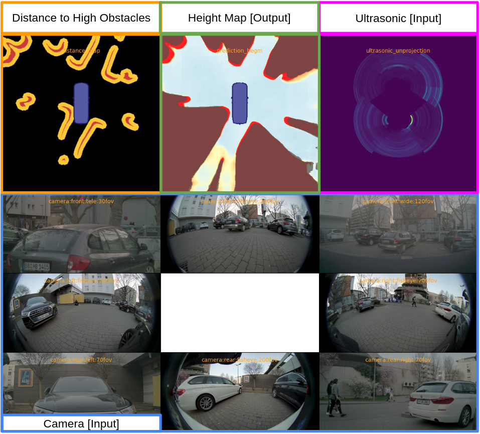
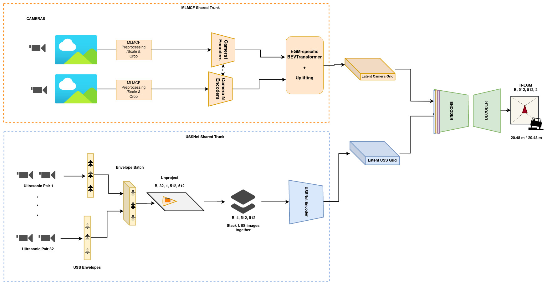
 Automatic parking assist must overcome some unique challenges when perceiving obstacles. An ego vehicle contains sensors that perceive the environment around…
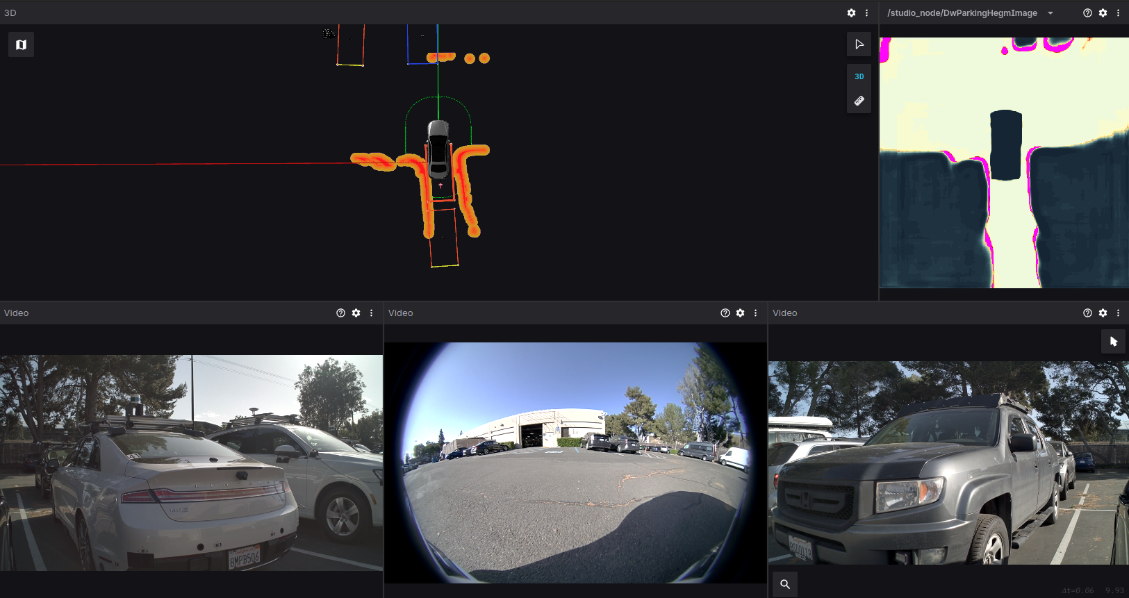
 So, you have a ton of data pipelines today and are considering investing in GPU acceleration through NVIDIA Base Command Platform. What steps should you take?…
 This post is part of a series on accelerated data analytics. Visualization brings data to life, unveiling hidden patterns and insights through accessible…