
 Learn the easier way to encode time-related Information by using dummy variables, cyclical coding with sine/cosine information, and radial basis functions.
Imagine you have just started a new data science project. The goal is to build a model predicting Y, the target variable. You have already received some data from the stakeholders/data engineers, did a thorough EDA, and selected some variables you believe are relevant for the problem at hand. Then you finally built your first model. The score is acceptable, but you believe you can do much better. What do you do?
There are many ways in which you could follow up. One possibility would be to increase the complexity of the machine-learning model you have used. Alternatively, you can try to come up with some more meaningful features and continue to use the current model (at least for the time being).
For many projects, both enterprise data scientists and participants of data science competitions like Kaggle agree that it is the latter – identifying more meaningful features from the data – that can often make the most improvement to model accuracy for the least amount of effort.
You are effectively shifting the complexity from the model to the features. The features do not have to be very complex. But, ideally, we find features that have a strong yet simple relationship with the target variable.
Many data science projects contain some information about the passage of time. And this is not restricted to time series forecasting problems. For example, you can often find such features in traditional regression or classification tasks. This article investigates how to create meaningful features using date-related information. We present three approaches, but we need some preparation first.
Setup and data
For this article, we mostly use very well-known Python packages as well as relying on a relatively unknown one, scikit-lego, which is a library containing numerous useful functionalities that are expanding scikit-learn’s capabilities. We import the required libraries as follows:
import numpy as np
import pandas as pd
import matplotlib.pyplot as plt
import seaborn as sns
from datetime import date
from sklearn.linear_model import LinearRegression
from sklearn.preprocessing import FunctionTransformer
from sklearn.metrics import mean_absolute_error
from sklego.preprocessing import RepeatingBasisFunction
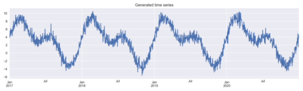
To keep things simple, we generate the data ourselves. In this example, we work with an artificial time series. We initiate by creating an empty DataFrame with an index spanning four calendar years (we use the pd.date_range). Then, we create two columns:
day_nr– a numeric index representing the passage of time-
day_of_year– the ordinal day of the year
Lastly, we have to create the time series itself. To do so, we combine two transformed sine curves and some random noise. The code used for generating the data is based on the code included in scikit-lego’s documentation.
# for reproducibility
np.random.seed(42)

# generate the DataFrame with dates
range_of_dates = pd.date_range(start="2017-01-01",
                           	End="2020-12-30")
X = pd.DataFrame(index=range_of_dates)

# create a sequence of day numbers
X["day_nr"] = range(len(X))
X["day_of_year"] = X.index.day_of_year

# generate the components of the target
signal_1 = 3 + 4 * np.sin(X["day_nr"] / 365 * 2 * np.pi)
signal_2 = 3 * np.sin(X["day_nr"] / 365 * 4 * np.pi + 365/2)
noise = np.random.normal(0, 0.85, len(X))

# combine them to get the target series
y = signal_1 + signal_2 + noise

# plot
y.plot(figsize=(16,4), title="Generated time series");
Then, we create a new DataFrame, in which we store the generated time series. This DataFrame will be used for comparison of the models’ performance using the different approaches to feature engineering.
results_df = y.to_frame()
results_df.columns = ["actuals"]
Creating time-related features
In this section, we describe the three considered approaches to generating time-related features.
Before we dive right into it, we should define an evaluation framework. Our simulated data contains observations from a period of four years. We will use the first 3 years of generated data as the training set and we will evaluate on the fourth year. We will use the Mean Absolute Error (MAE) as the evaluation metric.
Below we define a variable that will serve us for cutting off the two sets:
TRAIN_END = 3 * 365
Approach #1: dummy variables
We start with something that you are most likely already familiar with, at least to some degree. The easiest way to encode time-related information is to use dummy variables (also known as one-hot encoding). Let’s look at an example.
X_1 = pd.DataFrame(
	data=pd.get_dummies(X.index.month, drop_first=True, prefix="month")
)
X_1.index = X.index
X_1
Below, you can see the output of our operation.
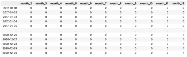
First, we extracted the information about the month (encoded as an integer in the range of 1 to 12) from the DatetimeIndex. Then, we used the pd.get_dummies function to create the dummy variables. Each column contains information on whether the observation (row) comes from the given month or not.
As you might have noticed, we have dropped one level and only have 11 columns now. We have done that in order to avoid the infamous dummy variable trap (perfect multicollinearity), which can be an issue when working with linear models.
In our example, we used the dummy variable approach to capture the month in which the observation was recorded. However, this same approach could be used to indicate a range of other information from the DatetimeIndex. For example, the day/week/quarter of the year, a flag whether a given day is a weekend, the first/last day of a period, and much, much more. You can find a list containing all the possible features we can extract from the pandas documentation index, available at pandas.pydata.org.
Bonus tip: This is outside of the scope of this simple exercise, but in real-life scenarios, we can also use information about special days (think national holidays, Christmas, Black Friday, and so on) to create features. holidays is a nice Python library containing past and future information about special days per country.
As described in the introduction, the goal of feature engineering is to shift complexity from the model side to the feature side. That is why we will use one of the simplest ML models – linear regression – to see how well we can fit the time series using only the created dummies.
model_1 = LinearRegression().fit(X_1.iloc[:TRAIN_END],
                             	y.iloc[:TRAIN_END])

results_df["model_1"] = model_1.predict(X_1)
results_df[["actuals", "model_1"]].plot(figsize=(16,4),
                                    	title="Fit using month dummies")
plt.axvline(date(2020, 1, 1), c="m", linestyle="--");
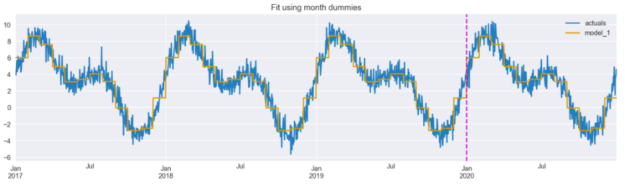
We can see that the fitted line already follows the time series quite well, though it is a bit jagged (step-like) – caused by the discontinuity of the dummy features. And that is what we will try to solve with the next two approaches.
But before proceeding it might be worth mentioning that when using non-linear models such as decision trees (or ensembles of thereof), we do not explicitly encode features such as month number or day of the year as dummies. Those models are capable of learning non-monotonic relationships between ordinal input features and the target.
Approach #2: cyclical encoding with sine/cosine transformation
As we have seen preceding, the fitted line resembles steps. That is because each dummy is treated separately with no continuity. However, there is a clear cyclical continuity present with variables such as time. What does that mean?
Imagine we are working with energy consumption data. When we include the information about the month of the observed consumption, it makes sense there is a stronger connection between two consecutive months. Using this logic, the connection between December and January and between January and February is strong. In comparison, the connection between January and July is not that strong. The same applies to other time-related information as well.
So how can we incorporate this knowledge into feature engineering? Trigonometric functions come to the rescue. We can use the following sine/cosine transformations to encode the cyclical time feature into two features.
def sin_transformer(period):
	return FunctionTransformer(lambda x: np.sin(x / period * 2 * np.pi))

def cos_transformer(period):
	return FunctionTransformer(lambda x: np.cos(x / period * 2 * np.pi))
In the snippet below, we copy the initial DataFrame, add the column with month numbers, and then encode both the month and day_of_year columns using the sine/cosine transformations. Then, we plot both pairs of curves.
X_2 = X.copy()
X_2["month"] = X_2.index.month

X_2["month_sin"] = sin_transformer(12).fit_transform(X_2)["month"]
X_2["month_cos"] = cos_transformer(12).fit_transform(X_2)["month"]

X_2["day_sin"] = sin_transformer(365).fit_transform(X_2)["day_of_year"]
X_2["day_cos"] = cos_transformer(365).fit_transform(X_2)["day_of_year"]

fig, ax = plt.subplots(2, 1, sharex=True, figsize=(16,8))
X_2[["month_sin", "month_cos"]].plot(ax=ax[0])
X_2[["day_sin", "day_cos"]].plot(ax=ax[1])
plt.suptitle("Cyclical encoding with sine/cosine transformation");
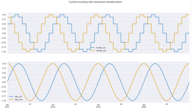
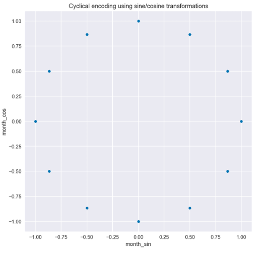
There are two insights we can draw from the transformed data, which is plotted in Figure 3. The first is that we can easily see that the curves are step-wise when using the months for encoding but when using daily frequency, the curves are much smoother; Secondly, we can also see why we must use two curves instead of one. Due to the repetitive nature of the curves, if you drew a straight horizontal line through the plot for a single year, you would cross the curve in two places. This would not be enough for the model to understand the observation’s time point. But with the two curves, there is no such issue, and a user can identify every single time point. This is clearly visible when we plot the values of the sine/cosine functions on a scatter plot. In Figure 4 we can see the circular pattern, with no overlapping values.
Let’s fit the same linear regression model using only the newly created features coming from the daily frequency.
X_2_daily = X_2[["day_sin", "day_cos"]]

model_2 = LinearRegression().fit(X_2_daily.iloc[:TRAIN_END],
                             	y.iloc[:TRAIN_END])

results_df["model_2"] = model_2.predict(X_2_daily)
results_df[["actuals", "model_2"]].plot(figsize=(16,4),
                                    	title="Fit using sine/cosine features")
plt.axvline(date(2020, 1, 1), c="m", linestyle="--");
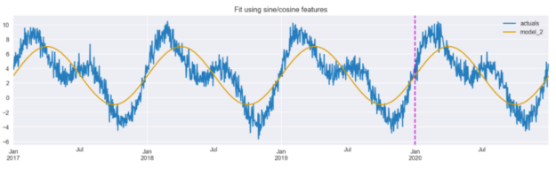
Figure 5 shows that the model is able to pick up the general trend of the data, identifying periods with higher and lower values. However, it appears that the magnitude of the predictions is less accurate, and at a glance, this fit appears worse than the one achieved using dummy variables (Figure 2).
Before we discuss the third feature engineering technique, it is worth mentioning that there is a serious drawback of this approach, which is apparent when using tree-based models. By design, the tree-based models make a split based on a single feature at the time. And as we have mentioned before, the sine/cosine features should be considered simultaneously in order to properly identify the time points within a period.
Approach #3: radial basis functions
The last approach uses radial basis functions. We will not go into much detail on what they actually are, but you can read a bit more on the topic here. Essentially, we again want to solve the issue we encountered with the first approach, that is, that there is a continuity to our time features.
We use the handy scikit-lego library, which offers the RepeatingBasisFunction class, and specify the following parameters:
- The number of basis functions we want to create (we chose 12).
- Which column to use for indexing the RBFs. In our case, that is the column containing information on which day of the year the given observation comes from.
- The range of the input – in our case, the range is from 1 to 365.
- What to do with the remaining columns of the DataFrame we will use for fitting the estimator.
”drop”will only keep the created RBF features,”passthrough”will keep both the old and new features.
rbf = RepeatingBasisFunction(n_periods=12,
                         	column="day_of_year",
                         	input_range=(1,365),
                         	remainder="drop")
rbf.fit(X)
X_3 = pd.DataFrame(index=X.index,
               	data=rbf.transform(X))

X_3.plot(subplots=True, figsize=(14, 8),
     	sharex=True, title="Radial Basis Functions",
     	legend=False);
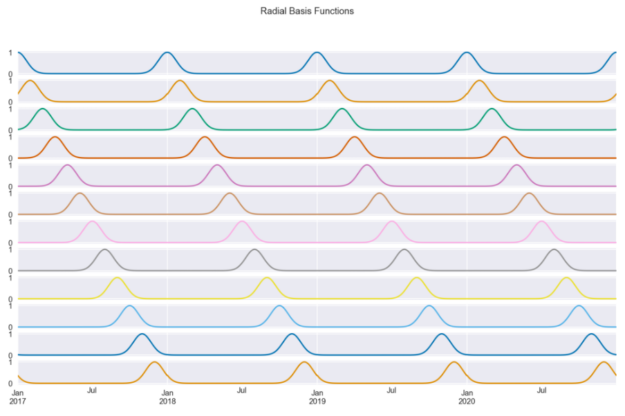
Figure 6 shows the 12 radial basis functions that we have created using the day number as input. Each curve contains information about how close we are to a certain day of the year (because we chose that column). For example, the first curve measures distance from January 1, so it peaks on the first day of every year and decreases symmetrically as we move away from that date.
By design, the basis functions are equally spaced over the input range. We chose 12 as we wanted the RBFs to resemble months. This way, each function shows approximately (because of the months’ unequal length) the distance to the first day of the month.
Similar to the previous approaches, let’s fit the linear regression model using the 12 RBF features.
model_3 = LinearRegression().fit(X_3.iloc[:TRAIN_END],
                             	y.iloc[:TRAIN_END])

results_df["model_3"] = model_3.predict(X_3)
results_df[["actuals", "model_3"]].plot(figsize=(16,4),
                                    	title="Fit using RBF features")
plt.axvline(date(2020, 1, 1), c="m", linestyle="--");
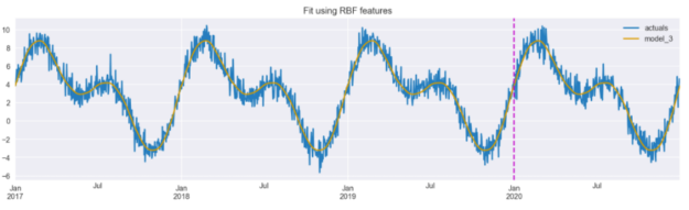
Figure 7 shows that the model is able to accurately capture the real data when using the RBF features.
There are two key parameters that we can tune when using radial basis functions:
- the number of the radial basis functions,
- the shape of the bell curves – it can be modified with the
widthargument ofRepeatingBasisFunction.
One method for tuning these parameter values would be to use grid search to identify the optimal values for a given data set.
Final comparison
We can execute the following snippet to generate a numeric comparison of different approaches to encoding time-related information.
results_df.plot(title="Comparison of fits using different time-based features",
            	figsize=(16,4),
            	color = ["c", "k", "b", "r"])
plt.axvline(date(2020, 1, 1), c="m", linestyle="--");
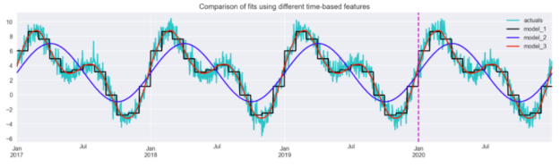
Figure 8 illustrates that the radial basis functions resulted in the closest fit from the considered approaches. The sine/cosine features allowed the model to pick up the main patterns but were not enough to capture the dynamics of the series entirely.
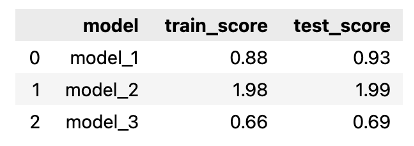
Using the snippet below, we calculate the Mean Absolute Error for each of the models, over both training and test sets. We expect the scores to be very similar between training and test sets, as the generated series is almost perfectly cyclical – the only difference between the years is the random component.
Naturally, that would not be the case in a real-life situation, in which we would encounter much more variability between the same periods over time. However, in such cases, we would also use many other features (for example, some measure of trend or the passage of time) to account for those changes.
score_list = []
for fit_col in ["model_1", "model_2", "model_3"]:
	scores = {
    	"model": fit_col,
    	"train_score": mean_absolute_error(
        	results_df.iloc[:TRAIN_END]["actuals"],
        	results_df.iloc[:TRAIN_END][fit_col]
    	),
    	"test_score": mean_absolute_error(
        	results_df.iloc[TRAIN_END:]["actuals"],
        	results_df.iloc[TRAIN_END:][fit_col]
    	)
	}
	score_list.append(scores)

scores_df = pd.DataFrame(score_list)
scores_df
As before, we can see that the model using RBF features resulted in the best fit, while the sine/cosine features performed the worst. Our assumption about the similarity of the scores between the training and test sets was also confirmed.
Takeaways
- We showed three approaches to encoding time-related information as features for machine learning models.
- Aside from the most popular dummy-encoding, there are approaches that are better suited for encoding the cyclical nature of time.
- When using those approaches, the granularity of the time interval greatly matters for the shape of the newly created features.
- Using the radial basis functions, we can decide on the number of functions we want to use, as well as the width of the bell curves.
You can find the code used for this article on my GitHub. In case you have any feedback, I would be happy to discuss it on Twitter.